Maybe you've gotten this message too.
I must say that I get a lot of spam, but the subject line intrigued me (it probably caught your attention too!).
No, it's not Wile E. Coyote cursing that darn Road Runner. I think it's Korean, or my computer's translation of Korean characters into ASCII.
Elmer sent me this message. No, not Elmer Fudd; Elmer Sinclair. I don't know who Elmer Sinclair is, but he doesn't sound Korean to me. So why Elmer Sinclair is sending me a Korean language email is beyond me.
[A little sleuth work revealed that the message originated with Daum Communications, which, according to Yahoo! Finance, "owns and operates South Korea's second-largest Internet portal at Daum.net. The company provides e-mail, online shopping, entertainment offerings, and financial services."]
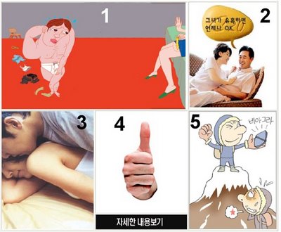
Something is lost in translation of the text part of the message. But the graphical part of the message, which depicts men, women, pills, thumbs, and conical mountain tops, is clear.
Here, take a look for yourself.

Obviously, we're looking at a Spam DTC ad here. The products are Cialis and Viagra (or counterfeit versions). BTW, I've never seen spam email offers for Levitra. Why is that?
Anyway, I cannot read the text, what little of it there is in this ad. But, like the Lincoln and beaver graphic in the Rozerem ads (see "Rozerem Ads Dis Lincoln, Show Beaver"), which also dominates that ad's space, I am able to easily decipher the above ad.
I am a bit confused, however, by a few panels.
Panel "1", for example, has got to be the setup. As such, it should show a guy with a performance problem. Every ad begins that way, doesn't it? The guy is obviously doing a strip tease in front of his mate. The prominent bulge in his briefs (look closely) tells us that he is ready to rock and roll. Why then does he need Cialis or Viagra? This is not a setup after all!
What about the off-camera seated woman -- who is still dressed -- holding what looks like a used condom? This, and her raised palm, is a complete turn-off! The women in ED DTC ads are supposed to want "it", not reject the guy! So, panel "1" misses the mark.
Panel "2" is cute. I especially like the Cialis dialog balloon! And I recognize the universal "OK", which leads me to think the guy in this panel is saying "Let's wait. I got 36 hours. OK?" Some guys also need to talk first, you know. I give panel "2" points for staying on message for that product.
Panel "3" is obvious. There's perhaps some unconventional sex going on, but each according to his and her tastes.
Panel "4" is also obvious. That thumb looks pretty erect to me! No ED there! I wonder what the characters below are saying? Whatever they say, it's superfluous.
Panel "5", on the other hand, requires deeper analysis. Here, we are looking at a triumphant man atop Mount Fuji holding up a Viagra pill, while down below is an exhausted loser, unable to mount Fuji.
The sexual symbolism of Mount Fuji has to be the reason why it is included in this ad. Why else would a Japanese icon be included in a Korean ad?
According to an entry in Wikipedia on the etymology of the name of this mountain, "The current kanji for Mt. Fuji .. mean wealth or abundan[ce] and a man with a certain status..." and "An early folk etymology claims that Fuji came from [kanji] meaning without equal or nonpareil. Another claims that it came from ... (not + exhaust), meaning neverending." and, finally, ""long well-shaped slope".
Panel "5", therefore, is a Viagra benefit statement, nonpareil!
This Korean spam DTC add, therefore, has all the major characteristics of an "effective" American-style print DTC ad -- such as the Rozerem ad. It depends a lot on imagery rather than words, it's a bit edgy and even obtuse, and it isn't afraid to use sexual symbolism. I would say it's very "creative" and definitely "cuts through the clutter." By these DTC standards, therefore, it has done its job!
Too bad it was sent to someone who could not translate the call to action, which appeared below the graphic: "kgdbjg d i anyym pb nj nd dg tytw vhg w l"

No comments:
Post a Comment